Case study 02 / 06
Self-initiated · Mobile app · Working title
OutThere
Friends want to see each other, but plans stall in the group chat and fall apart on the day. I designed and built an app that suggests somewhere worth going near you, always says why, and helps the plan survive the day and repeat.
- My role
- Product Designer & Developer
- Team
- Solo, with AI pair programming
- Timeline
- July to November 2026
- Context
- Self-initiated, built to launch
- Methods
- Market scan, competitor review, proto-personas, journey map
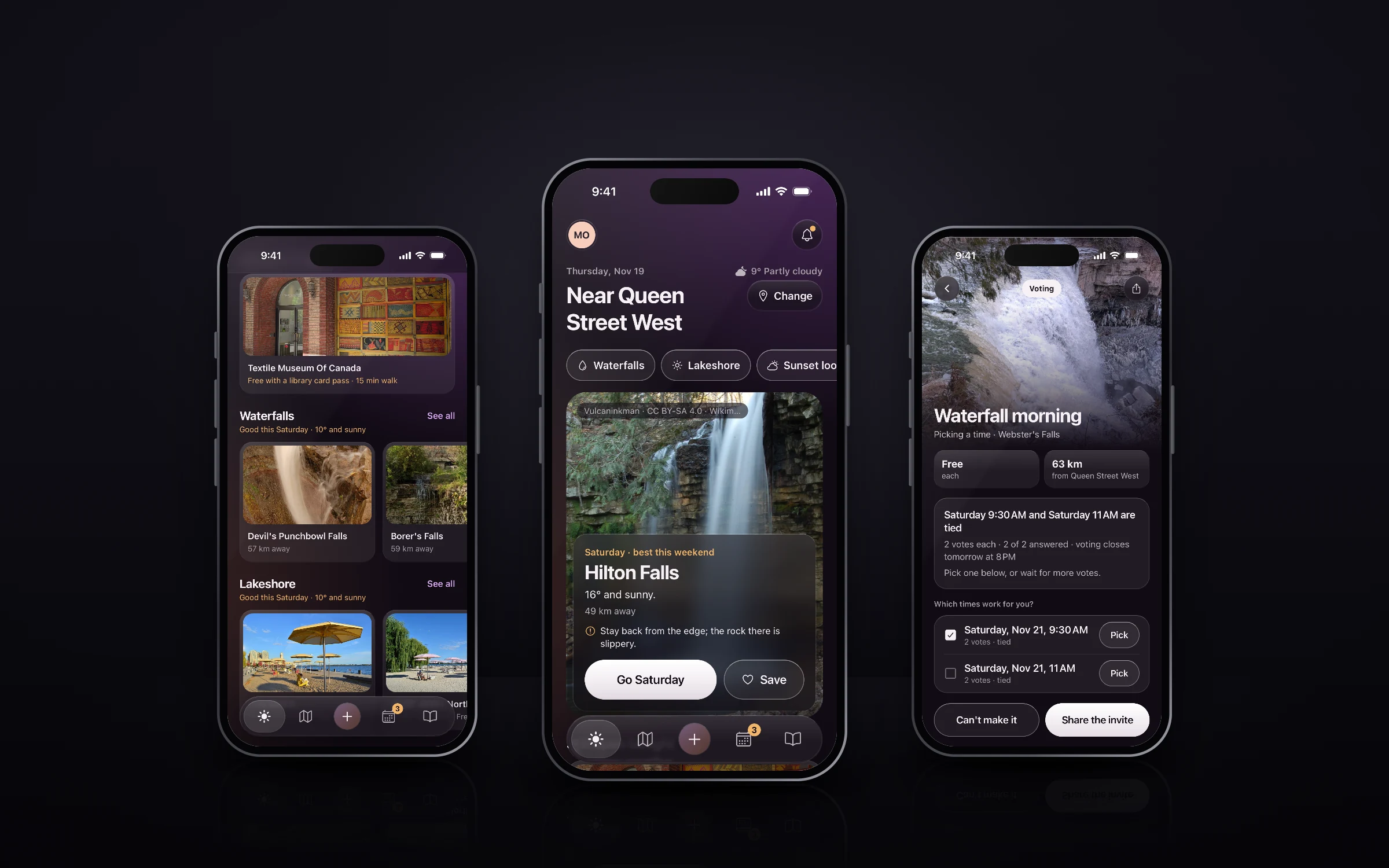
At a glance
The problem
Friends want to see each other, but plans stall in the group chat and fall apart on the day. Every planning app stops helping once the invite is sent.
My part
Everything, solo: the research, personas and journey map, product strategy, UX/UI, the design system, and the working app.
What happened
A working app on iPhone, Android and the web, through three changes of direction. It’s tested as software; sessions with users are next.
- Goal
- Help friends who already want to see each other turn “we should” into a plan that survives the day, and make the next one the default.
- Success measure
- Plans that actually happened, per crew, per month. How I’ll measure it
57
Live screens, after cutting 17 that couldn’t work for real
3
Platforms from one codebase
20
Activities, every suggestion with a reason
Problem: “We should hang out” rarely becomes a plan.
Apps for making plans compete at two points: sending the invite (Partiful, Apple Invites) and meeting strangers (Timeleft, Bumble BFF). The pain sits after both. Plans fall apart between “I’m in” and the day, one friend always does the organizing, and nothing repeats.
About two-thirds of UK 18 to 34 year olds flake on plans, and 69% of Canadians admit cancelling on friends. Cost decides too: 44% of Gen Z and millennials skip events to save money.
How might we
…help friends who already want to see each other turn “we should” into a plan that survives the day, and make the next one the default?
Sources: IPA 2025, Ipsos Canada 2024, Ally Financial 2025.
Approach: Desk research first, honestly labelled.
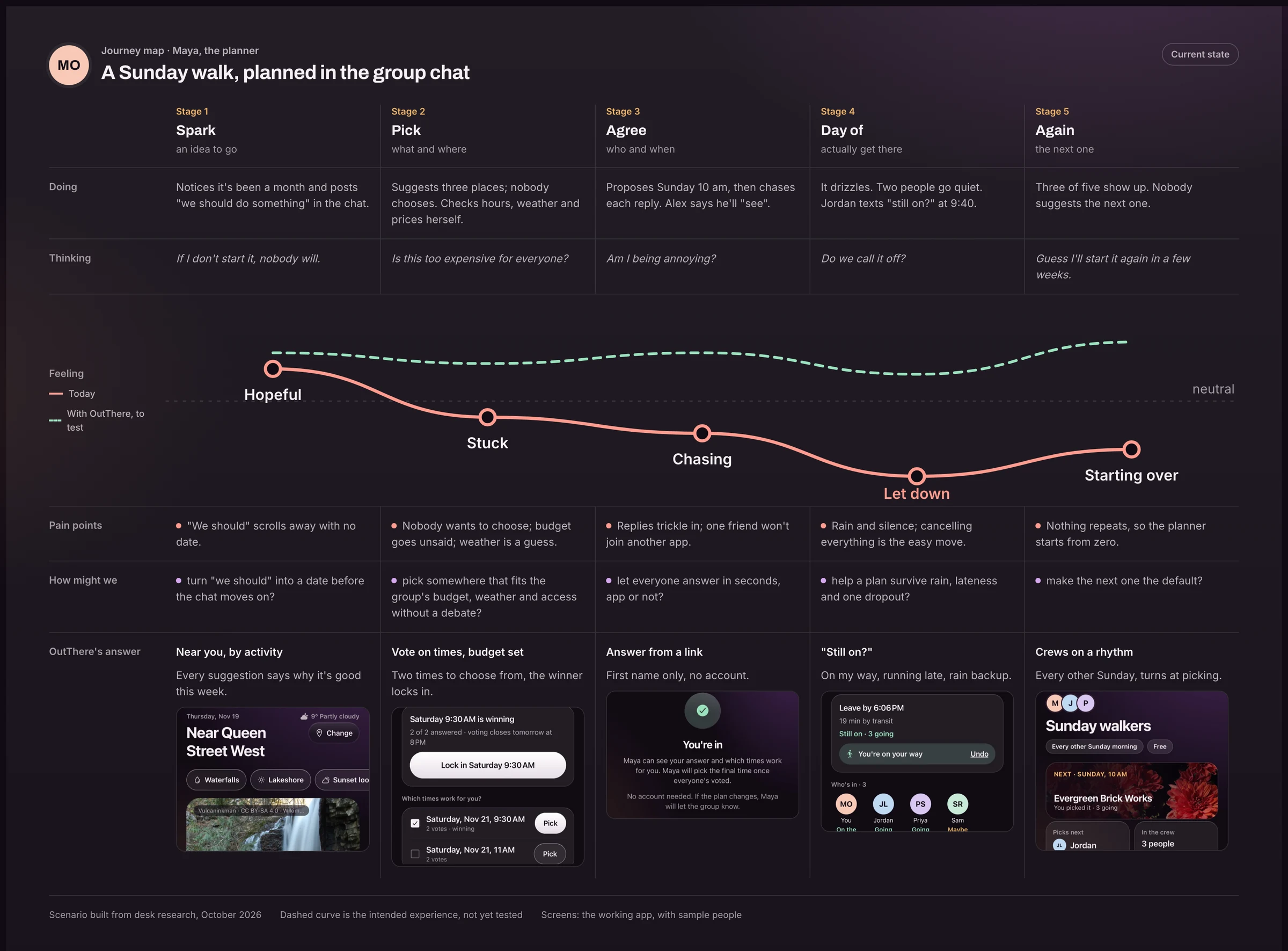
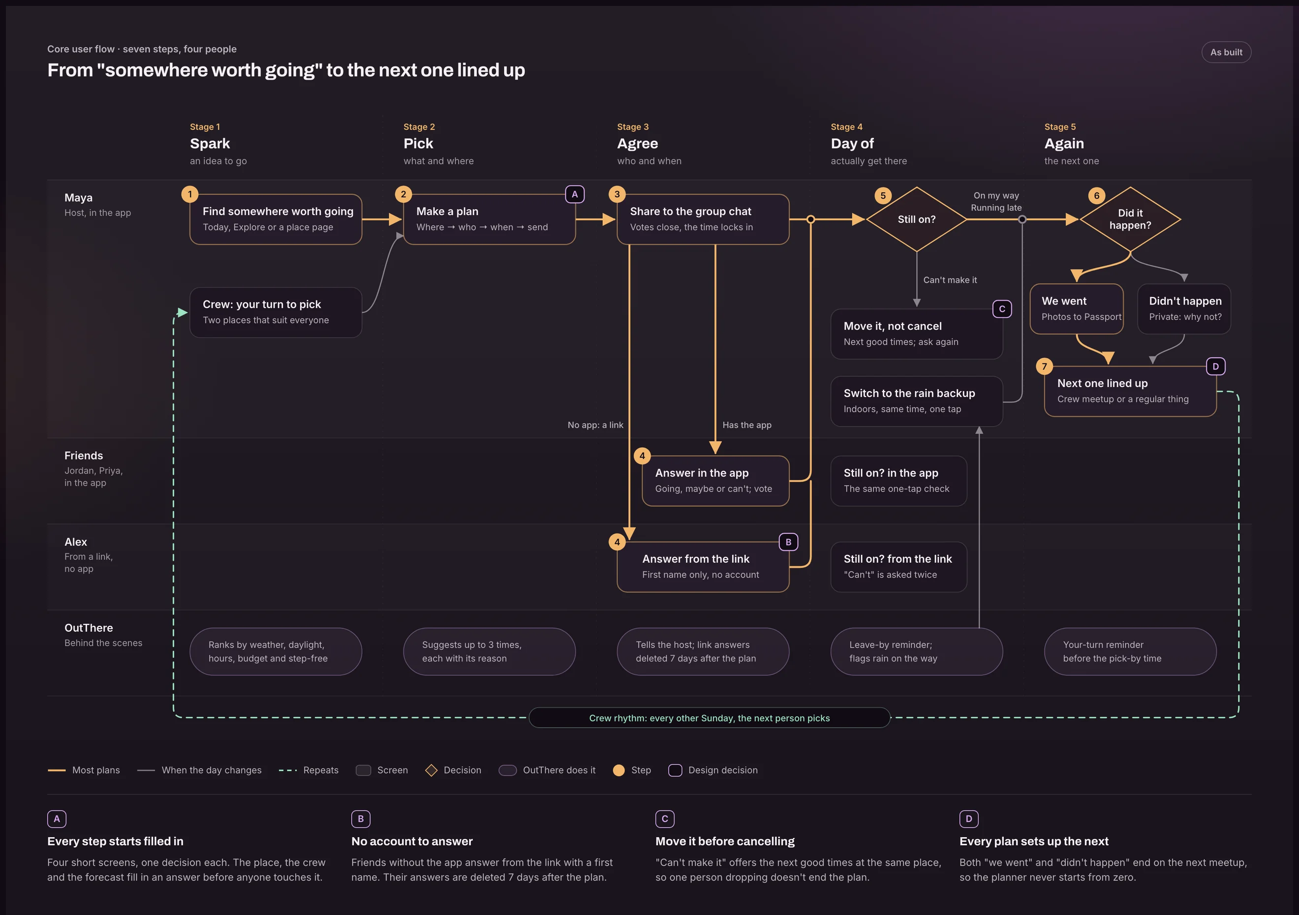
I started with a market scan of planning apps and 30+ published surveys and reviews, then a competitor review a week later. The scan mapped where every kind of app puts its effort across five stages of a plan: spark, pick, agree, day of, and again. Almost nothing helps on the day or with the next one. That gap became the product.
Five stages of a plan
- Sparkan idea to go
- Pickwhat and where
- Agreewho and when
- Day ofactually get thereOpen ground
- Againthe next oneOpen ground
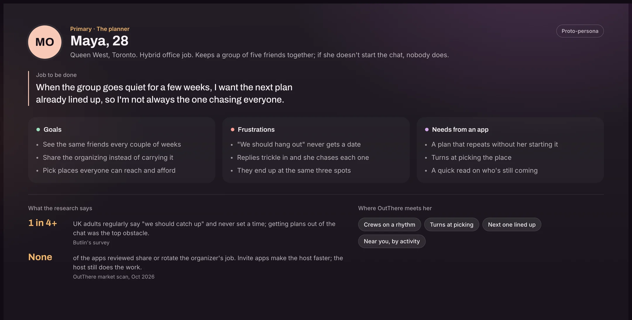
Who it’s for: Four proto-personas and a journey map.
I built four proto-personas from the research and labelled them as assumptions until interviews confirm them. Maya, the planner, is primary: the app is designed for the person who keeps the group together. The other three decide whether her plan actually happens.
Deep diveThe four proto-personasMaya the planner, plus Jordan, Priya and Alex, who decide whether her plan happens. Proto-personas from desk research, October 2026. Not yet validated in interviews.
How it changed: Three changes of direction in two weeks.
July: memories of real visits.
The first version rewarded going somewhere with a private memory and a passport. It was well built, but it didn’t get people out together.
October 17: plans with friends that know the place.
Weather, daylight, hours and transit became the edge over invitation apps.
October 23: the day of, and doing it again.
The market scan showed those were the open gaps, so “Still on?” and crews that meet on a rhythm moved to the centre.
November 1: exploring is the front door.
The app leaned too hard on inviting people. Finding somewhere worth going came first; friends became how a trip happens.
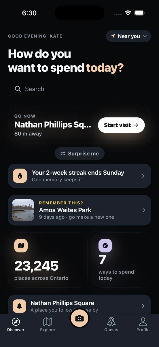
Decisions: Key design decisions.
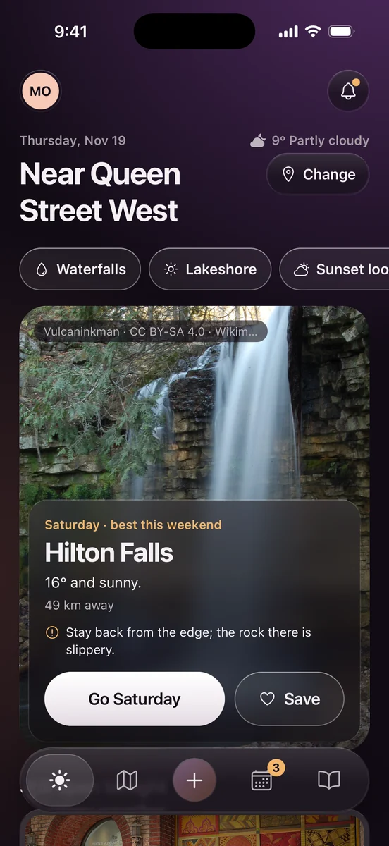
Every suggestion in the app has to answer “why is this here?”.
Today leads with one pick and its reason
- Chose
- One best place this week, with the day it’s best and why (“Saturday, best this weekend, 16° and sunny”)
- Instead of
- A feed of everything nearby
- Why
- People decide faster from one strong, explained option than from a list. The reason is the product.
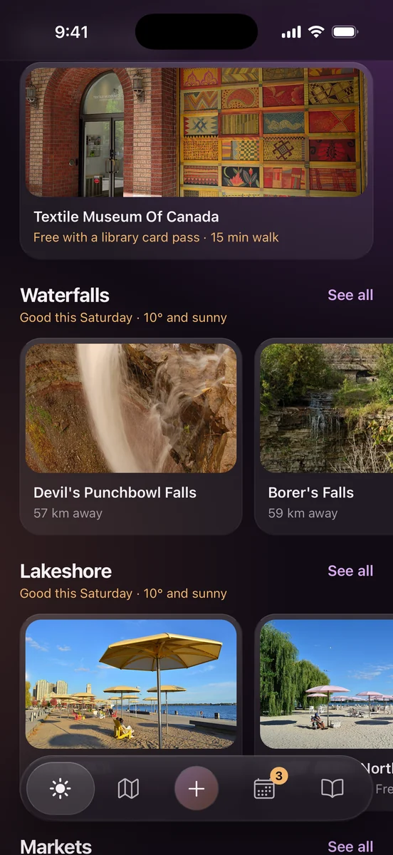
Suggestions in rows, one question each
- Chose
- A row per activity, with the shared reason said once in the row heading, and each card showing only what’s different
- Instead of
- The same reason repeated on every card
- Why
- Shelves (Netflix, Airbnb) let you scan by topic and browse sideways. A reason repeated on every card stops informing.
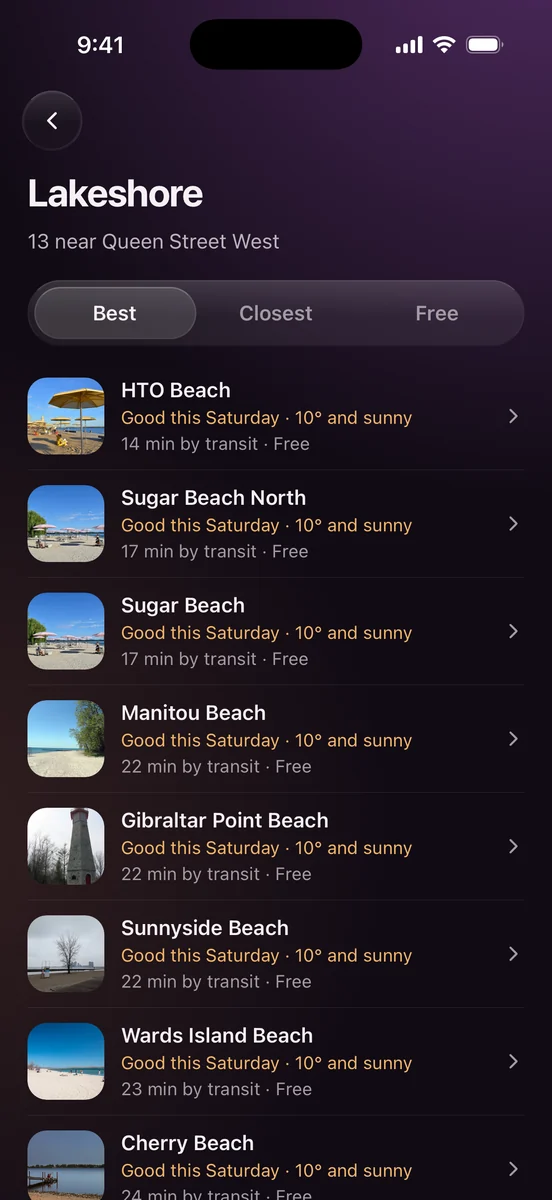
“See all” leads somewhere you can sort
- Chose
- A full list sortable by Best, Closest and Free, always visible
- Instead of
- A link that dropped people on an unrelated screen
- Why
- Those three are how people actually choose a place. A visible segmented control beats a hidden sort menu.
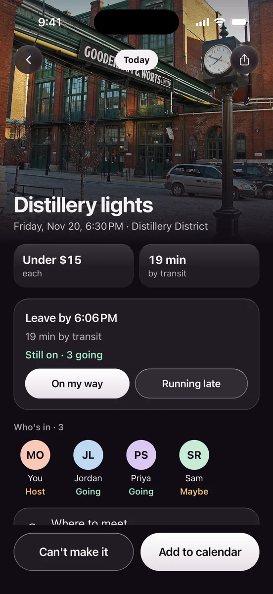
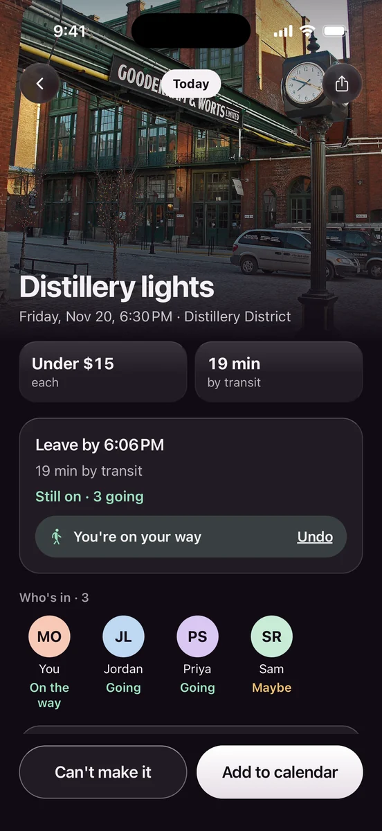
“Still on?” on the day
- Chose
- One tap: on my way, running late, or can’t make it. “Can’t” offers new times at the same place before cancelling.
- Instead of
- A plan that silently dies when one person drops
- Why
- The day of is where plans fail. Moving keeps the plan alive; cancelling makes the organizer start over.
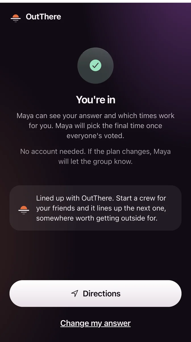
Friends answer from a link
- Chose
- First name only, no account, no download; answers are deleted 7 days after the plan
- Instead of
- Asking everyone to install an app
- Why
- Making everyone join was the top complaint about a competing app.
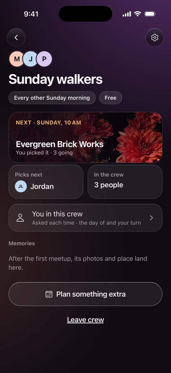
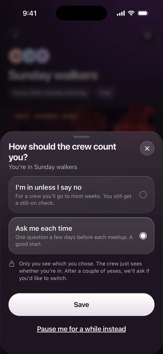
Crews on a rhythm, with turns
- Chose
- A crew meets every other Sunday; picking rotates; the next one is lined up
- Instead of
- One person always organizing
- Why
- It shares the planner’s load and makes seeing friends the default.
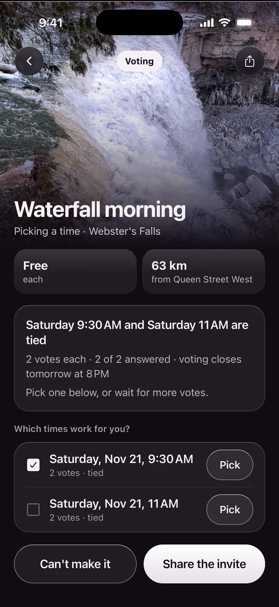
Ties are shown as ties
- Chose
- “9:30 and 11 are tied. Pick one, or wait for more votes.”
- Instead of
- Quietly calling one time the winner
- Why
- The app never claims something it can’t back up.
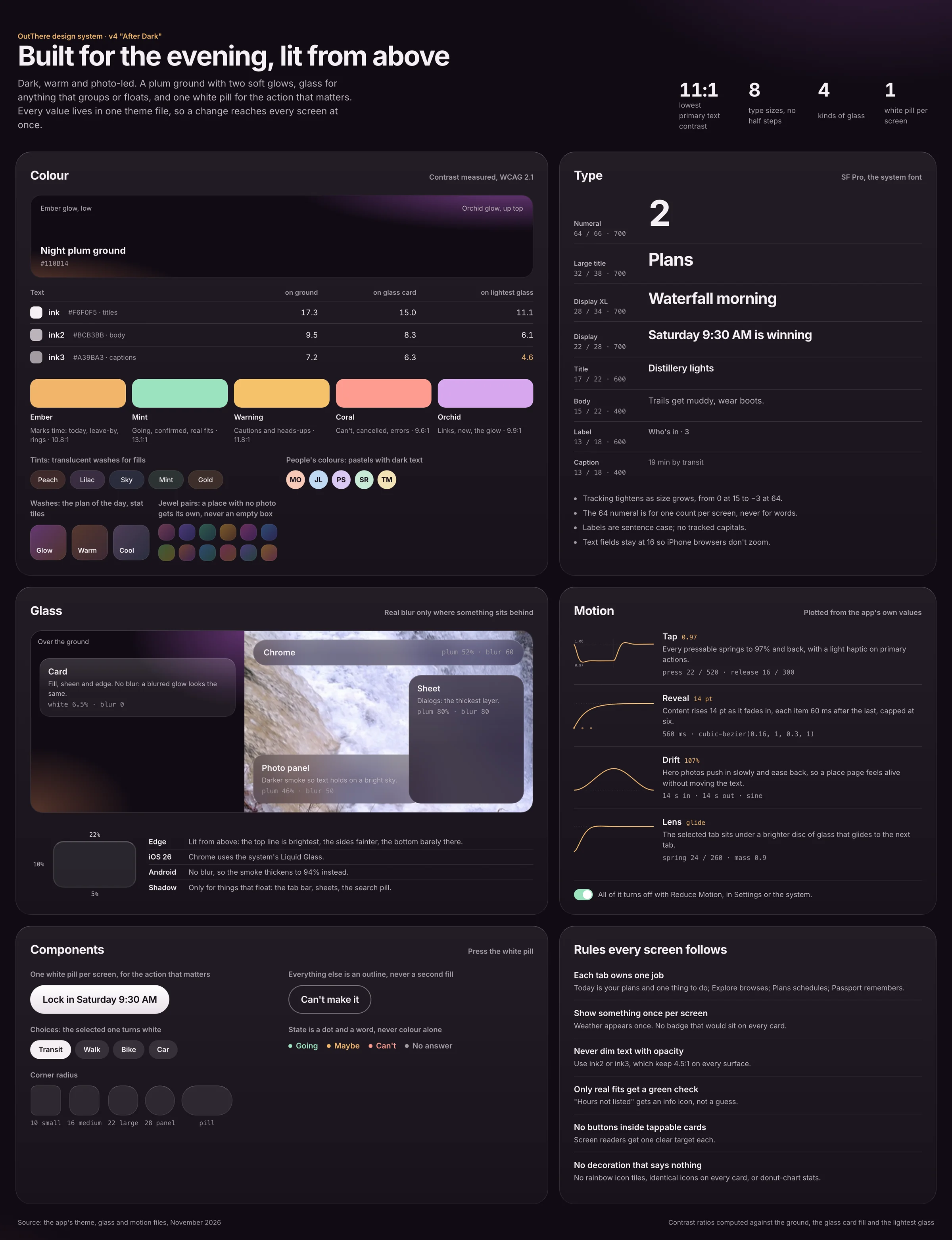
Design system: A design system called After Dark.
A plum ground with two soft glows, glass for anything that groups or floats, and one white pill per screen for the action that matters. Every value lives in one theme file, so a change reaches every screen at once. Text contrast is measured on every surface, not eyeballed: the lightest text still passes 4.5:1 on the lightest glass.
Rules every screen follows
- Each tab owns one job.
- Show something once per screen.
- Never dim text with opacity.
- Only real fits get a green check.
- No buttons inside tappable cards.
- No decoration that says nothing.
Deep diveThe full After Dark design systemColour with measured contrast, the type scale, four kinds of glass, motion curves and components, on one page.
Built for real: Built for real.
I didn’t hand off a prototype; I shipped the design, and kept its details intact in code. One codebase runs on iPhone, Android and the web, where friends answer invites. Built with AI pair programming, designed and directed by me.
What I cut
Cut: 17 screens that couldn’t work for real
Every sample account, filler screen and “simulate” button. Every word on screen now comes from the person’s real area, forecast and plans.
Cut: Memories as the centre of the app
The July version rewarded visits with a private memory and a passport. It was well built, but it didn’t get people out together. The passport stayed, and now counts plans that happened.
Cut: Invites as the front door
The app leaned too hard on inviting people. Finding somewhere worth going comes first now; friends are how a trip happens.
Cut: Anything shown twice, or saying nothing
Like the same reason repeated on every card. Two of the design system’s rules keep it out: show something once per screen, and no decoration that says nothing.
Behind the screens
- Private by default
- Every record is locked to the people allowed to see it.
- Deleting really deletes
- Deleting an account deletes it, photos included.
- Reports
- Reports reach a moderator straight away.
- Friends without the app
- They can answer a plan, and their answers are deleted after the plan.
Testing: Testing, and what’s next.
The app is tested as software, not yet with people: end-to-end runs with real accounts, every live screen checked for errors and leftover sample text, and automated database checks. Before launch I’m running five planner interviews, two with people who plan around access needs, and five moderated sessions on the core tasks: find a place, invite a friend without the app, answer the link, say you’re running late, start a crew. The measure that matters after launch is plans that actually happened, per crew, per month.
How I’ll measure it
- PickPlans started from a suggestionMoved by decisions 01, 02, 03
- AgreeInvites answered, app or notMoved by decisions 05, 07
- Day ofPlans still on, or moved instead of cancelledMoved by decision 04
- AgainCrews that meet again on their rhythmMoved by decision 06
What would change my mind
| What I’m betting on | How I’ll test it | I’m wrong if |
|---|---|---|
| Plans fail on the day, not at the invite. | Five planner interviews, two with people who plan around access needs. | Planners say plans stall earlier, at choosing where or when. |
| Friends will answer from a link with just a first name. | Moderated session: answer the link as a friend without the app. | People hesitate to answer without an account, or expect to sign up first. |
| One tap is enough to keep a plan alive on the day. | Moderated session: say you’re running late. | People still go back to the group chat to explain. |
| One pick with a reason gets people moving faster than a list. | Moderated session: find a place. | People skip the pick to browse, or can’t say why it was suggested. |
| A crew on a rhythm makes the next plan the default. | Moderated session: start a crew, plus the planner interviews. | Planners see a standing plan as one more thing to organize. |
Reflection: What I learned.
Every suggestion needs a reason.
Writing “why is this here?” on every card exposed the parts of the app that were just filling space.
Cutting is designing.
Removing 17 screens that couldn’t work for real made the app clearer than any new feature did.
Research changes the product, not just the slides.
The market scan moved the app from invitations to the day of the plan.