Burlington Central Library Wayfinding
Designing an accessible mobile wayfinding experience to help library visitors navigate public space with confidence.
Role
UX Researcher / Mobile Interface Designer
Course
DEI 613
Timeline
3 weeks
Platform
Mobile Web / QR-Based Public Space Interface
Project Type
Academic UX Research & Prototype Project
Approach
Accessibility-Led, Inclusive Design
Focus Areas
Tools
Overview
This project explored how people navigate the Burlington Central Library and how a mobile interface could improve wayfinding for visitors who may feel uncertain, excluded, or unsupported within the physical space.
Through field observation, I identified several navigation and accessibility barriers, especially for newcomers, older adults, and visitors with low vision. While many regular visitors moved confidently through the library, first-time users often paused, re-oriented themselves, relied on staff for help, or overlooked existing signage and directory information.
In response, I designed a medium-fidelity mobile prototype for a digital directory and interactive map. The experience is accessed through QR codes placed at key decision points such as entrances, exits, elevators, and staircases. The prototype helps users understand where they are, locate library resources, access floor-by-floor maps, and use accessibility tools such as text-to-speech, dyslexia-friendly mode, and zoom text.
The Design Challenge
User Problem
Library visitors — especially newcomers, older adults, and visually impaired users — may struggle to orient themselves in a multi-level public space when signage is small, visual-only, or easy to miss.
Accessibility Problem
Existing wayfinding relies heavily on visual cues, ceiling signage, and staff support, creating barriers for users with low vision, limited tech confidence, or unfamiliarity with the space.
Design Opportunity
Create a mobile wayfinding experience that gives users clearer navigation, accessible support, real-time orientation, and confidence while moving through the library.
How might we make public library navigation more accessible, intuitive, and independent for visitors with different abilities, confidence levels, and familiarity with the space?
Research Context
For this assignment, I returned to my Wayfinding and Space Audit activity, where I observed how people navigated the Burlington Central Library.
The library was an ideal research environment because it serves a diverse range of users, including students, older adults, children, families, newcomers, regular visitors, and people using accessible technologies.
Field Observations
What I saw across three floors of the library.
First Floor
- Most visitors appeared to understand where they were going
- Several self-checkout kiosks were available near the entrance
- Staff were frequently used for support
- A printed directory existed near the front entrance but was small and easy to miss
- Ceiling signs helped some users but required people to look up
- No braille was present on visible signage
- A computer with magnified zoom text was available near the elevator
- A digital event screen was present, but few users stopped to read it
- Many visitors preferred using the elevator instead of the stairs
Second Floor
- A help desk was placed near the top of the stairs
- Visitors could ask staff for assistance with technology
- A children's area was located toward the back of the floor
- Some users relied on staff rather than signage to locate resources
Third Floor
- The third floor was quieter and mainly used for desks, computers, studying, and individual work
- It was the only floor without a visible help desk
- A makerspace was located toward the back of the floor
- Users appeared more independent but also had fewer immediate support options
Key Research Insights
Five patterns that shaped the design direction.
Existing Directories Were Easy to Miss
The main directory was small and located near the entrance, but many visitors did not notice it. Newcomers were more likely to pause, scan the space, or ask staff for help.
Navigation Relied Too Heavily on Visual Cues
Most signage was visual-only, ceiling-mounted, and lacked braille or tactile support, limiting independence for visitors with low vision.
Digital Systems Were Not Equally Accessible
Self-checkout kiosks were useful for confident users, but they could feel intimidating for older adults, newcomers, or people unfamiliar with digital interfaces. The kiosks also lacked text-to-speech support.
Staff Filled the Gaps in the Wayfinding System
Visitors often relied on staff when signage, directories, or technology did not give them enough confidence to move independently.
Users Needed Reassurance
Visitors did not only need directions. They needed confirmation that they were in the right place, on the right floor, and moving toward the correct resource.
User Groups
Three visitor types drawn from field observation.
The Newcomer Navigating a New Space
Primary Goal
Explore and use library resources independently while understanding how the space is organized.
Context
A first-time visitor who recently relocated to the community and wants to learn about library services, events, and technology.
Pain Points
- Small entrance directory is easy to miss
- Hanging signage assumes familiarity with the layout
- Multi-level navigation requires re-orientation
- May need to ask staff for reassurance
Needs
- Clear visual cues at eye level
- “You are here” orientation
- A digital map with floor-by-floor guidance
- Visible help indicators near decision points
The Returning Visitor Seeking Familiarity
Primary Goal
Borrow books and use computers with minimal disruption to established habits.
Context
A regular visitor who knows the general layout but may feel uncomfortable with new digital systems or updated processes.
Pain Points
- Digital checkout systems can feel intimidating
- Small or low-contrast signage limits readability
- Prefers asking staff over risking mistakes with technology
Needs
- Larger, high-contrast signage
- Simple step-by-step digital guidance
- Familiar navigation patterns
- Clear access to human support when needed
The Focused User with Low Vision
Primary Goal
Access quiet study spaces and technology that supports visual needs.
Context
A visitor who uses the library for studying, computers, or accessible workstations and is comfortable with assistive technology.
Pain Points
- Lack of braille and tactile signage
- Hanging signs are hard to perceive
- Accessible technology is limited and not clearly marked on every floor
- Navigation depends heavily on prior knowledge or staff assistance
Needs
- Braille and tactile cues
- Text-to-speech support
- Zoom text and high-contrast options
- Clearly marked accessible workstations
- Floor-by-floor accessibility information
Design Goals
Improve orientation
Help users understand where they are and what resources are nearby.
Reduce reliance on staff
Support independent navigation while still making help easy to find.
Make accessibility visible
Provide accessibility tools directly within the interface rather than hiding them.
Support multiple confidence levels
Design for regular visitors, newcomers, tech-confident users, and tech-hesitant users.
Design Foundations
The project was grounded in design thinking, inclusive design, accessibility principles, and Don Norman's principles from The Design of Everyday Things.
Design thinking helped me empathize with users and translate field observations into design opportunities. Inclusive design helped me identify how existing systems excluded certain visitors, especially visually impaired users and older adults. Don Norman's work reinforced the importance of intuitive, visible, and accessible design that helps users understand what actions are possible.
Design Thinking
Used to empathize with library visitors, define navigation pain points, and develop a user-centred mobile solution.
Inclusive Design
Guided the focus on users who may be excluded by visual-only signage, small directories, or inaccessible digital systems.
Accessibility
Informed features such as text-to-speech, zoom text, dyslexia-friendly mode, high contrast, and alternative map controls.
Intuitive Design
Focused on making the interface predictable, easy to scan, and supportive for people navigating a physical space.
Concept Overview
The final concept is a QR-based mobile wayfinding tool for Burlington Central Library.
Visitors would scan QR codes placed at entrances, exits, elevators, staircases, and key floor locations. The mobile interface would open directly to a digital directory and interactive map, helping users understand their current location and navigate to resources.
The experience includes
Core Experience Walkthrough
Six screens guide visitors from arrival to confident navigation.
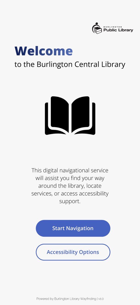
Welcome / Onboarding
Users are introduced to the mobile wayfinding tool and can quickly begin navigating the library.
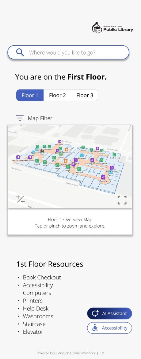
Floor Selection
Users can choose the floor they are on or the floor they want to explore.
Interactive Map
Users view a simplified map with “you are here” orientation, resource labels, and clear navigation cues.
Resource View
Users can browse services, rooms, technology, washrooms, accessibility supports, and event areas by floor.
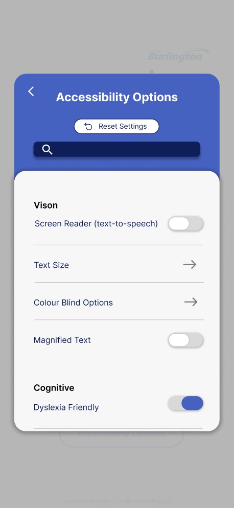
Accessibility Options
Users can enable text-to-speech, zoom text, dyslexia-friendly mode, colour-blind filters, and other support settings.
AI Assistant
Users can ask navigation questions or choose suggested prompts to get help locating library resources.
Ideation & Sketching
I began by sketching multiple low-fidelity concepts for improving navigation in the Burlington Central Library.
My original concept explored an augmented reality navigation system where users could view directions through their phone camera. However, after considering technical limitations, accuracy issues, and the challenge of indoor AR mapping, I pivoted toward a more practical mobile wayfinding interface supported by AI assistance.
This pivot helped make the solution more realistic, accessible, and easier for a wider range of library visitors to use.
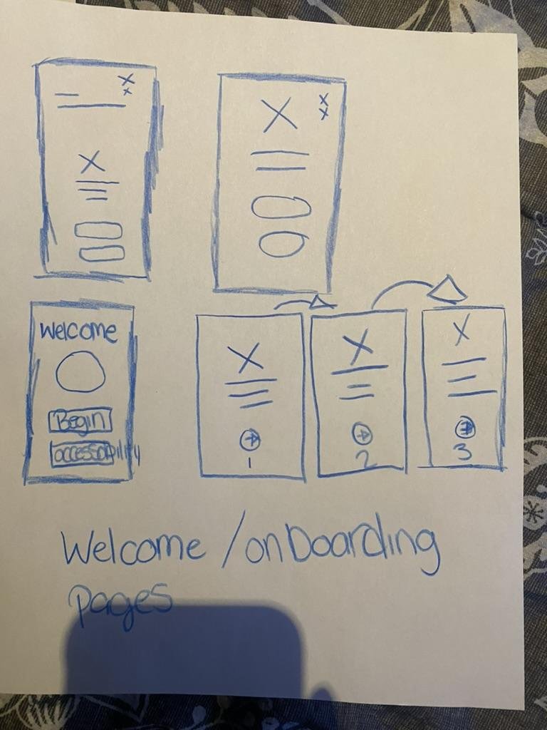
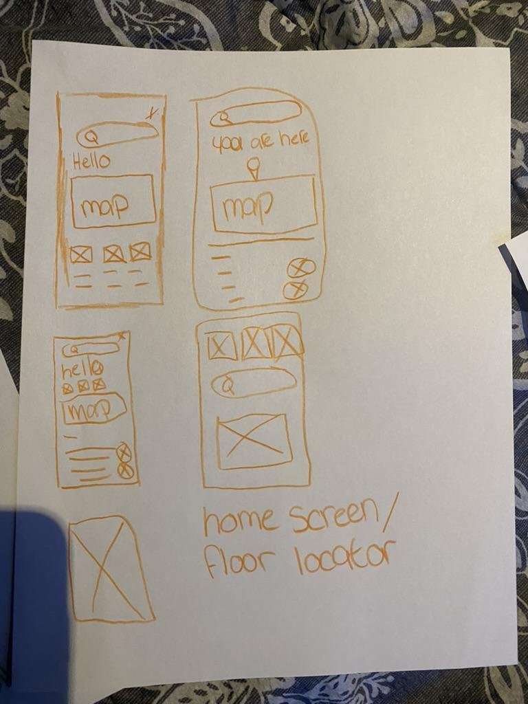
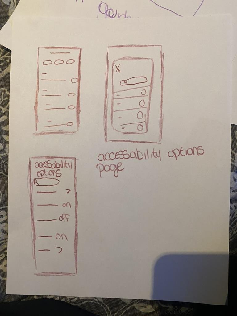
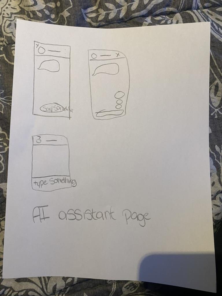
Early sketches exploring AR guidance, floor maps, accessibility pages, onboarding, and AI assistant concepts.
Low-fidelity exploration helped me move from a complex AR concept toward a more practical QR-based mobile experience.
AI-Assisted Testing & Refinement
Using GPT-5 to pressure-test accessibility, usability, and clarity.
After creating the medium-fidelity prototype, I used GPT-5 to simulate a user interacting with the interface and asked for feedback on accessibility, usability, visual clarity, and inclusivity.
Identified Strengths
- Clear interface structure
- Predictable navigation pattern
- Consistent visuals and iconography
- Strong foundational accessibility features
- Calm and trustworthy colour palette
- Accessibility options included early in the design
Areas for Improvement
- Some text sizes were too small
- Light grey body text needed stronger contrast
- Map zones relied too heavily on colour
- The interface needed visible focus indicators
- Pinch-to-zoom map interaction could be difficult for motor-impaired users
- Some screens could reduce text density
- The AI assistant prompt buttons needed more spacing
Iterative Design Changes
Five rounds of refinement driven by AI-assisted review and peer critique.
Improved Text Readability
- Increased font size to at least 16pt
- Changed light grey body text to darker text
- Improved contrast for readability
Improved Map Accessibility
- Added plus and minus zoom controls
- Reduced reliance on pinch gestures
- Recommended adding labels, icons, or patterns to map zones
Improved AI Assistant Spacing
- Spaced suggested prompt buttons farther apart
- Reduced cognitive load
- Made the assistant page easier to scan
Improved Interface Clarity
- Removed extra branding from the top-left corner
- Kept the Burlington Central Library logo to free up whitespace
- Improved visual focus and reduced clutter
Strengthened Accessibility Settings
- Added text-to-speech option
- Supported zoom text
- Included dyslexia-friendly and colour-blind modes
- Made accessibility tools easier to identify
Final Design Highlights
The polished medium-fidelity prototype for accessible library wayfinding.
Highlights
Final medium-fidelity prototype for accessible library wayfinding.
The mobile interface supports visitors who may miss physical signage or need additional accessibility support.
AI-assisted feedback helped refine readability, spacing, map controls, and accessibility features.
Accessibility Considerations
Designed for visual, motor, cognitive, and wayfinding needs.
Visual Accessibility
Text-to-speech, zoom text, larger font sizing, darker text, high contrast, colour-blind support, and clearer map labeling.
Motor Accessibility
Large buttons, simple layouts, plus/minus map zoom controls, and reduced reliance on pinch gestures.
Cognitive Accessibility
Progressive disclosure, floor-by-floor navigation, clear icons, dyslexia-friendly mode, reduced text density, and spaced interaction options.
Wayfinding Accessibility
“You are here” cues, QR codes near decision points, floor maps, visible resource categories, and clear help pathways.
Impact
Framed as design value — this is an academic prototype, not a launched product.
Improved Navigation Confidence
The prototype helps users understand where they are and what resources are available without relying only on staff or ceiling signage.
More Inclusive Public Space Access
The design supports visitors who may be excluded by visual-only signage, small directories, or unfamiliar digital systems.
Practical AI-Assisted Design
The project shows how AI can support the UX process by assisting with persona refinement, accessibility review, and prototype critique.
Limitations
Because this was an academic prototype, there are important limitations that would need to be addressed before implementation.
Future Improvements
Usability Testing
Test the prototype with library visitors, including older adults, newcomers, and people with low vision.
Staff Feedback
Interview library staff to understand common navigation questions and support needs.
Physical Signage Integration
Pair the mobile experience with improved eye-level signage, braille, tactile cues, and clearer physical directories.
QR Placement Strategy
Map the best locations for QR codes near entrances, elevators, staircases, washrooms, service desks, and floor transition points.
Improved Map System
Add more detailed labels, patterns, icons, and accessible routes for each floor.
Expanded Accessibility Testing
Evaluate the prototype with screen readers, keyboard navigation, voice control, and WCAG contrast checks.
Reflection
This project helped me understand how wayfinding is not only about helping people move through a space, but also about helping them feel confident, included, and independent.
One of my biggest takeaways was that accessibility cannot be treated as a separate feature. It needs to shape the entire experience, from signage and maps to digital interfaces and staff support.
I also learned how AI can support the design process when used critically. GPT-5 helped me identify accessibility concerns I may have overlooked, but I still validated its suggestions against my field notes and design goals.
If I continued this project, I would prioritize usability testing with real library visitors, work with accessibility experts, and explore how the mobile tool could connect with improved physical signage throughout the library.
Skills Demonstrated
This project reflects my interest in designing digital experiences that make public spaces easier, more accessible, and more welcoming for everyone.